With bespoke kitchens lasting anywhere from 15 to 20 years, choosing the right colour is important.
Here is what the most considered homeowners in the North East are choosing right now, and why it works.
Warm Neutrals Are Back – But Not the Grey You Remember
The neutrals making an impact are warm, earthy, and rich with character: think taupe, mushroom, clay, and soft almond tones.
These shades perform beautifully in North East homes, where natural light can vary significantly across seasons. Warm neutrals reflect what light there is, creating a sense of space and comfort. Paired with natural oak worktops or stone surfaces, they offer the kind of effortless elegance that never looks dated.
If you are drawn to a neutral palette but want something with personality, clay and mushroom tones offer far more depth than white ever could – without the unforgiving maintenance that comes with a bright white kitchen.
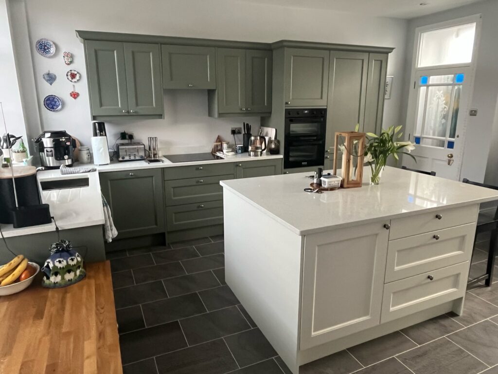
Green: The Standout Colour of the Moment
Across the UK, green was very popular in 2025. Forest green, sage, hunter green, and olive are all performing strongly – appealing to homeowners who want warmth, character, and a connection to the natural world.
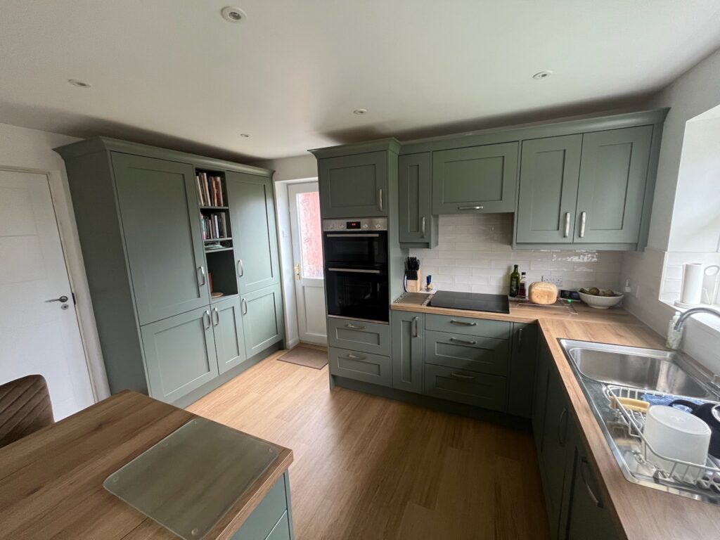

Sage green, in particular, is proving exceptionally versatile. It works in both traditional shaker-style kitchens and contemporary handleless designs. Pair it with brushed brass hardware and a warm stone worktop, and the result is striking without being bold to the point of fatigue.
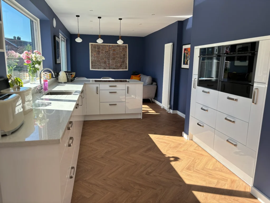
Two-Tone Kitchens
One of the most exciting shifts in bespoke kitchen design is the growing appetite for two-tone colour schemes. Rather than a single colour running from floor to ceiling, homeowners are increasingly choosing one tone for base units and a contrasting or complementary colour for wall units or a kitchen island.

Deep navy lower cabinets paired with warm off-white uppers. A charcoal island anchoring a run of soft sage units. A dusty blush shaker kitchen with a dark, statement island.
This is where a bespoke approach to kitchen design earns its place. At Premier Kitchens, the ability to specify colour precisely – drawing on paint ranges from Farrow & Ball, Little Greene, and RAL custom colours – means the kitchen you design is genuinely one-of-a-kind. A two-tone scheme executed well elevates a kitchen from functional to exceptional.
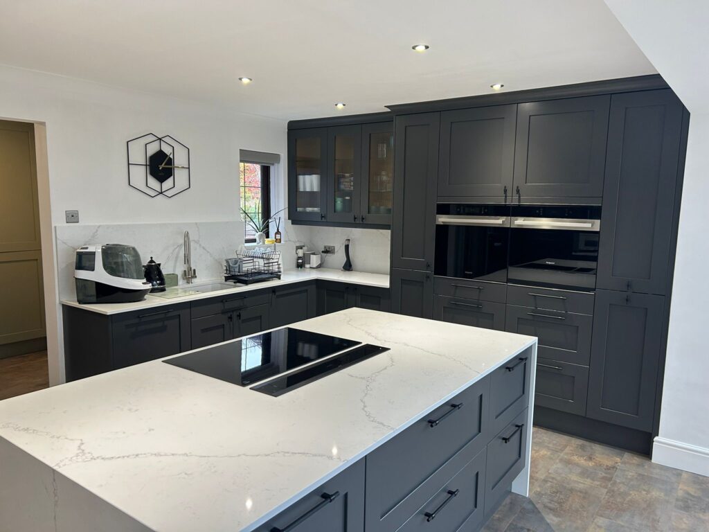
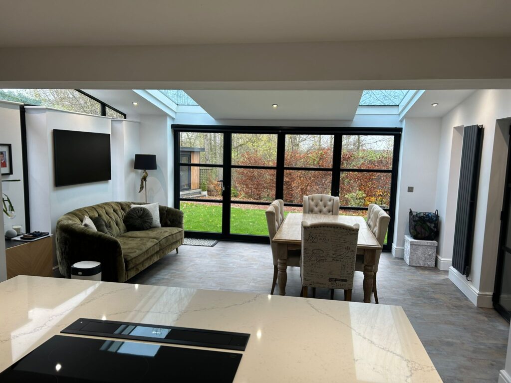
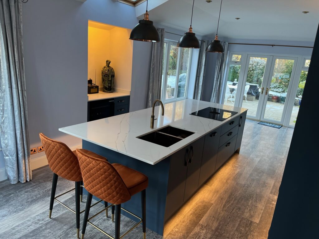
Dark and Moody: When Bold Colours Work
Navy blue, midnight blue, and charcoal have all moved from niche choices to mainstream, proving especially popular for lower cabinets or kitchen islands. The key is balance – dark cabinetry demands lighter worktops, good task lighting, and thoughtful hardware choices.
In larger, open-plan kitchens – increasingly common across County Durham and Northumberland – darker cabinetry can anchor a space beautifully, adding drama and a sense of luxury without overwhelming the overall room.

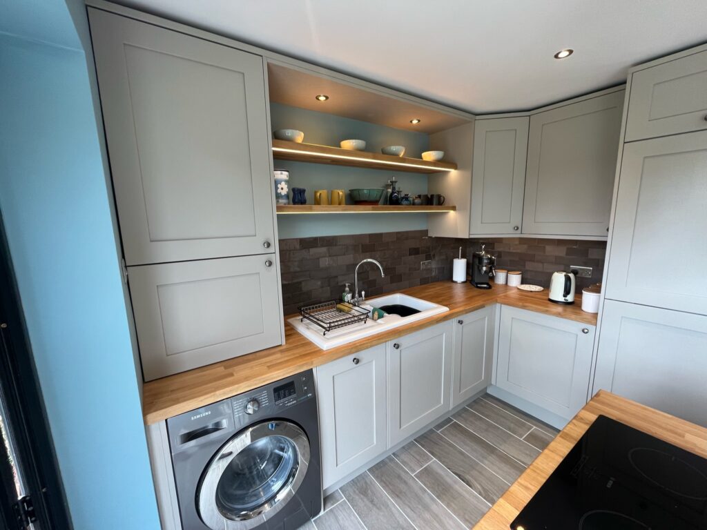
Colours for Small Kitchens
Colour choices in a compact kitchen carry more weight than in a larger space. The wrong decision can make a room feel enclosed and difficult to work in. The right one can make a small kitchen feel considerably bigger than its footprint suggests – and far more considered than a default white finish.
The instinct to paint everything white is understandable but often misplaced. Flat white cabinetry in a small kitchen can feel clinical and one-dimensional, particularly in rooms with limited natural light. Soft off-whites, warm creams, and pale almond tones do the same job of reflecting light while adding a sense of depth that flat white cannot.
For homeowners willing to be bolder, pale pastels – dusty sage, soft blush, and muted duck egg – are proving highly effective in smaller spaces. These colours read as light and airy without the starkness of white, and they introduce personality without the visual weight of deeper tones. A pale sage handleless kitchen in a compact galley layout, for instance, feels fresh and calm rather than busy.
Colour Drenching
Colour drenching is another technique worth considering for small kitchens. Rather than contrasting cabinetry against walls in different shades – which can break up the eye and actually make a room feel smaller – painting cabinetry, walls, and even the ceiling in the same tone creates a cohesive, enveloping effect.
Worktop & Splashback Colours
Worktop and splashback choices matter just as much as cabinetry colour in a small kitchen. Pale stone-effect quartz, running continuously from worktop to splashback without a break, eliminates the visual interruption of a tile border and makes a compact run of units feel longer and more expansive.
What to avoid in a small kitchen is not necessarily dark colour – it is poorly balanced dark colour. A very deep tone on every surface, with no contrast from worktops, walls, or hardware, is what creates the enclosed feeling people associate with dark kitchens. One strong colour choice, well-supported by lighter elements, can work in a small space just as effectively as in a large one.